Neurodiveristy in Albertopolis
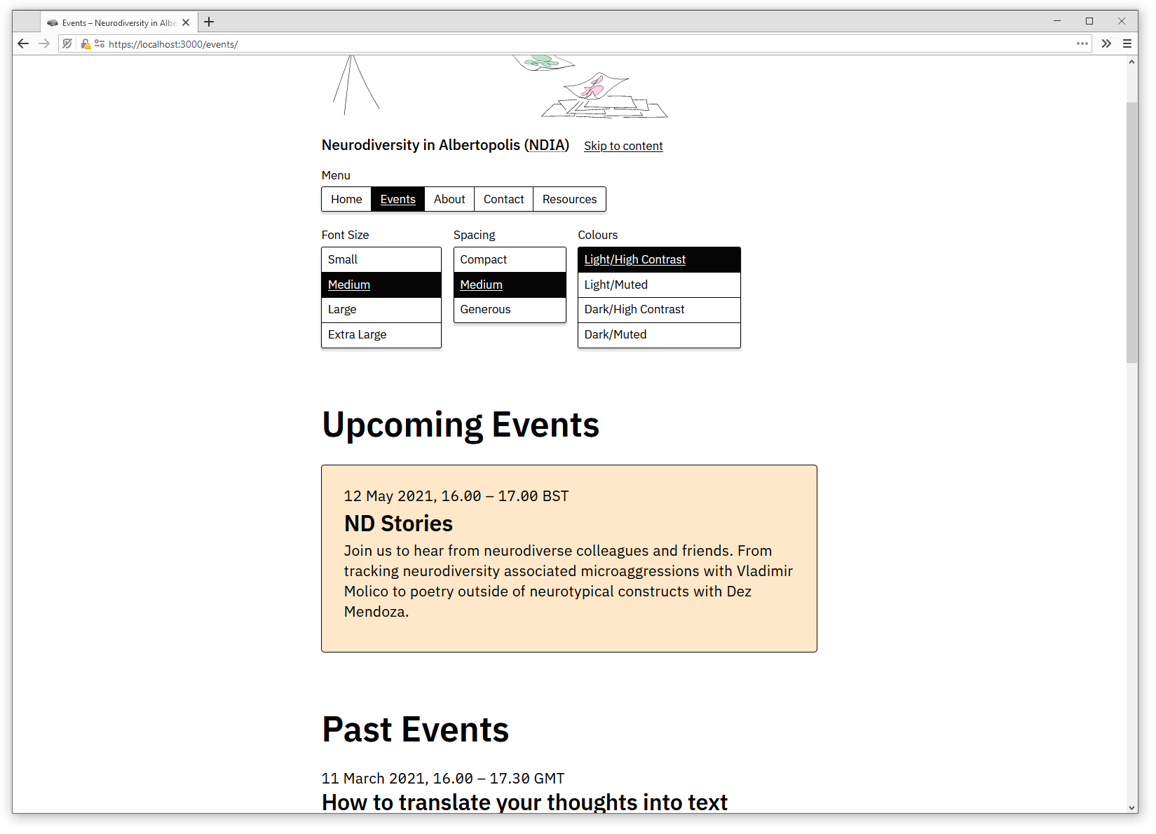
A new website for a network of neurodiverse staff and students from colleges and museums on Exhibition Road, London SW7.

The main activity of Neurodiversity in Albertopolis is to run talks and workshops at the Royal College of Art (RCA), Imperial College, and other participating institutions.
These events are usually advertised on an institution's own website - for instance by the RCA or Imperial. That's a problem for people looking to go to these events (it's easy to the announcement) and those organising them (it's hard to get an announcement online, especially at an institution other than your own).
The new website solves both of these problems by giving the public a single, well-organised source for all of the network's events, and by giving contributors direct editing access. In addition, the site contains information about NDIA and its contributors and a collaborative list of resources.
Design notes
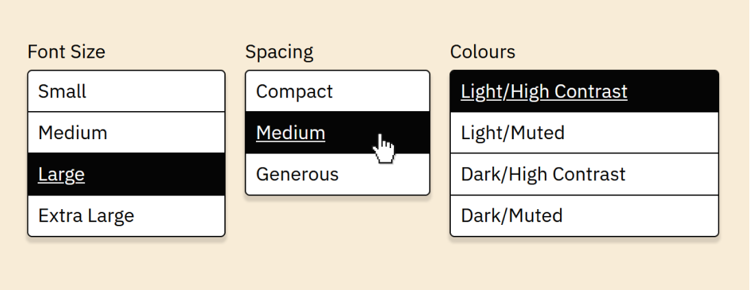
The goal of the design is to make the information on the site accessible to as many people as possible. The result is a simple, single-column layout with a clear hierarchy, highly readable type, and strong colour contrast. In addition, we built a set of access tools that let people adjust the type sizes, spacing, and colours of the site.
IBM Plex
Character differentiation in sans-serif typefaces
We decided to replace GT Cintetype, which the group had been using for some of its materials, with IBM Plex Sans. There were a few reasons for that:
- Better legibility. Plex is especially good at differentiating similar-looking letters, like I, l, i, and t. It does this by incorporating design moves we usually see in programming typefaces - like wide serifs on the I, pronounced hooks on the l and t, open counters in the e and c, and a slashed 0.
- Plex is open-source, which means everyone in the network can get it and use it however they need to without having to think about licensing.
- Plex has a variable font version, which allowed me to make subtle adjustments to weight and width at different points in the design space. It's also good for website performance because the entire typeface fits into a single file.
I do miss one feature of Cinetype: the exagerated diacritics and punctuation marks. They're especially useful in distinguishing i, j, and ! from the other vertical characters. If I ever get a type design workflow together, I might fork Plex and try adjusting it in that respect - and I'll be allowed to do that thanks to the open-source license.
Access tools

We decided to add a set of access tools to the site for a couple of reasons. One is practical: It's hard (if not impossible) to find a set of typographic parameters that will make the site pleasant to read for absolutely everyone. While one person might need large type to read comfortably, another might prefer small type to be able to read a whole paragraph in context.
The access tools address that problem by opening up a parameter space of many different type sizes, spacing options, and colour themes that hopefully encompasses the requirements of a wider group of people.
The other reason is that putting tools like these in a prominent location sends a message: We're aware of people's diverse needs, we think they're valid, and we're working toward addressing them. It's a small extension of the bigger political project NDIA is engaged in.
The adjustments you make with these tools aren't purely mechanical - I adjust the type scale, font width, weight, and spacing at many points in the design space. In earlier writing on this idea, I called this process shaping the design space.
I took care to describe the individual options in a way that doesn't imply a distinction between "normal" and "accessibility" modes - I see each of the 48 possible combinations as equally valid.
Tech notes
- The access tools are implemented with CSS variables. We use session cookies to remember the choices people made across page loads.
- The average page weighs about 200kb and makes six HTTP requests: The document, a CSS file, a Javascript file, the typeface (all the weights come in a single
wofffile), an event illustration, and the favicon. - We use no analytics software.
- The site is built on the Wordpress/Timber/Advanced Custom Fields stack and served through Cloudflare.
Credits
- Design and development by me
- Illustrations by my pal Roland Ross.
- I learned about character differentiation from a lecture on the development of Atkinson Hyperlegible
- We got the idea for the access tools from a lecture called Choose your Access Settings by Studio Hyte and Sophie Hoyle
- When I was developing the site I got a lot of good information from the A11Y Project, especially their WCAG Compliance Checklist
View the live site at ndia.co.uk